Sammy G’s Honey Bees

Project Type: Brand Identity

Project Description:

Sammy G’s Honey Bees, a local beekeeper nestled in Bathurst, NSW, embarked on a sweet venture into the world of honey sales. Seeking to establish a distinctive brand identity, they envisioned a design that was not only fresh and polished but also brimming with personality and a touch of playfulness.

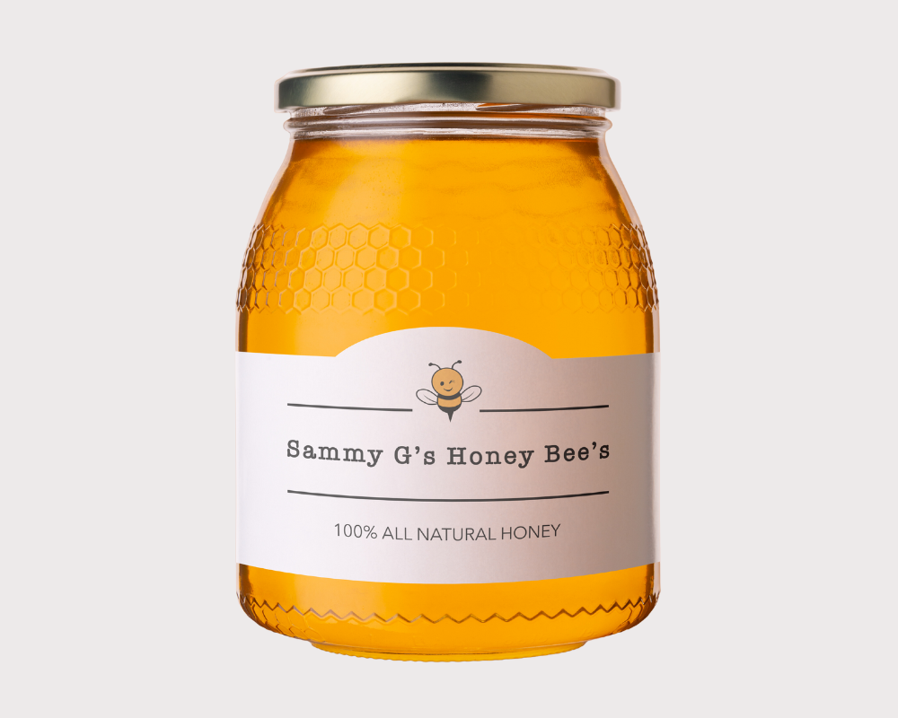
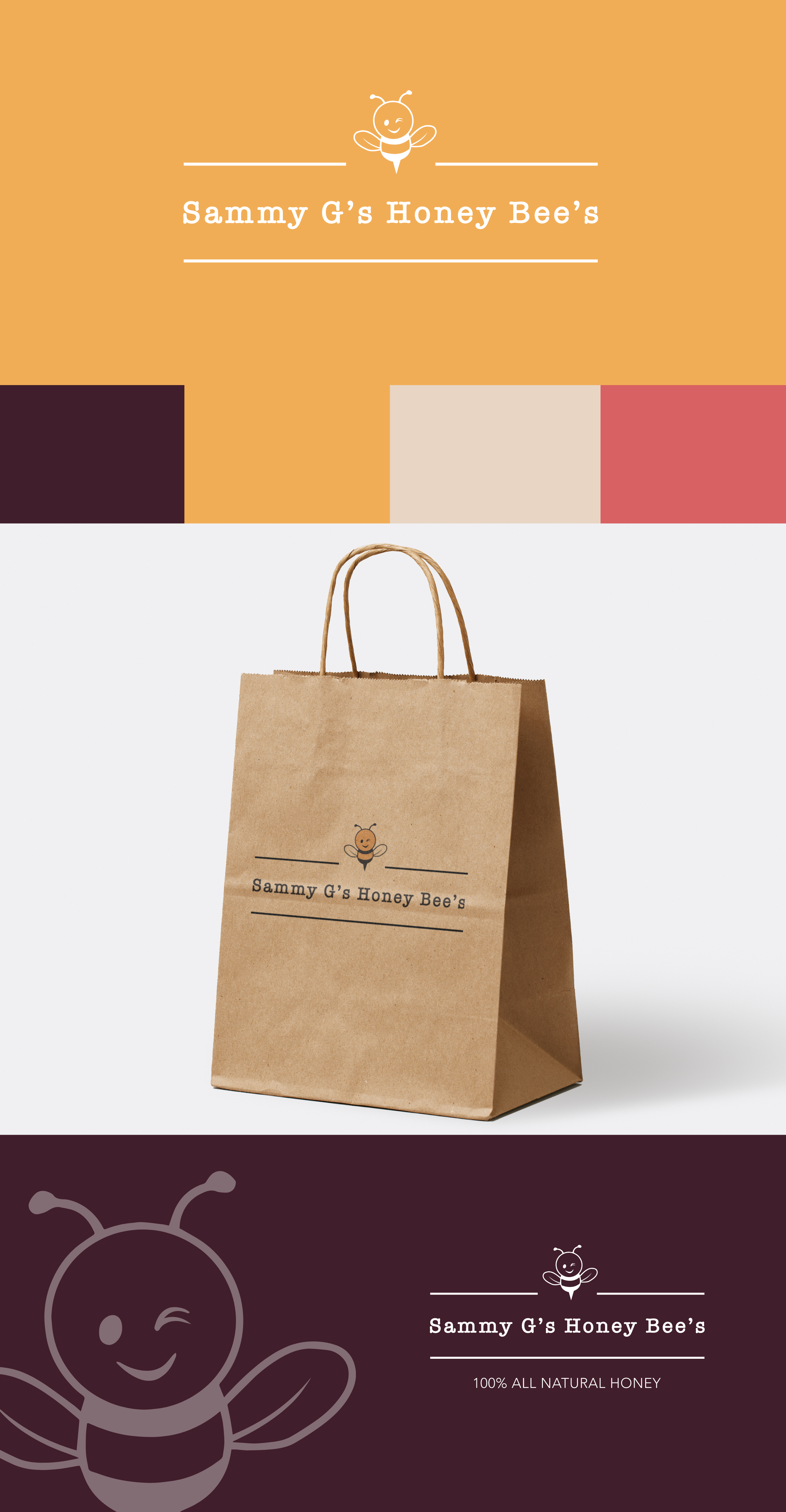
The resulting brand identity perfectly encapsulates the essence of Sammy G’s Honey Bees. A whimsical, type-writer typeface and hand-drawn bee illustration, injects character, playfulness and warmth into the brand. This carefully crafted combination embodies the unique personality and cheeky spirit that sets Sammy G’s Honey Bees apart in the market.

Principals Applied:

Logo Creation | Colour Theory | Typography Theory

Let's do this!

Ready to Get Started?