
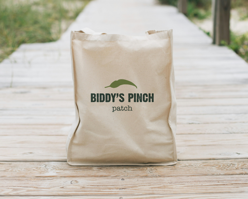
With their produce growing in popularity at local markets and shops, it became evident that establishing a brand identity was the next step to elevate their business and stand out from the crowd.
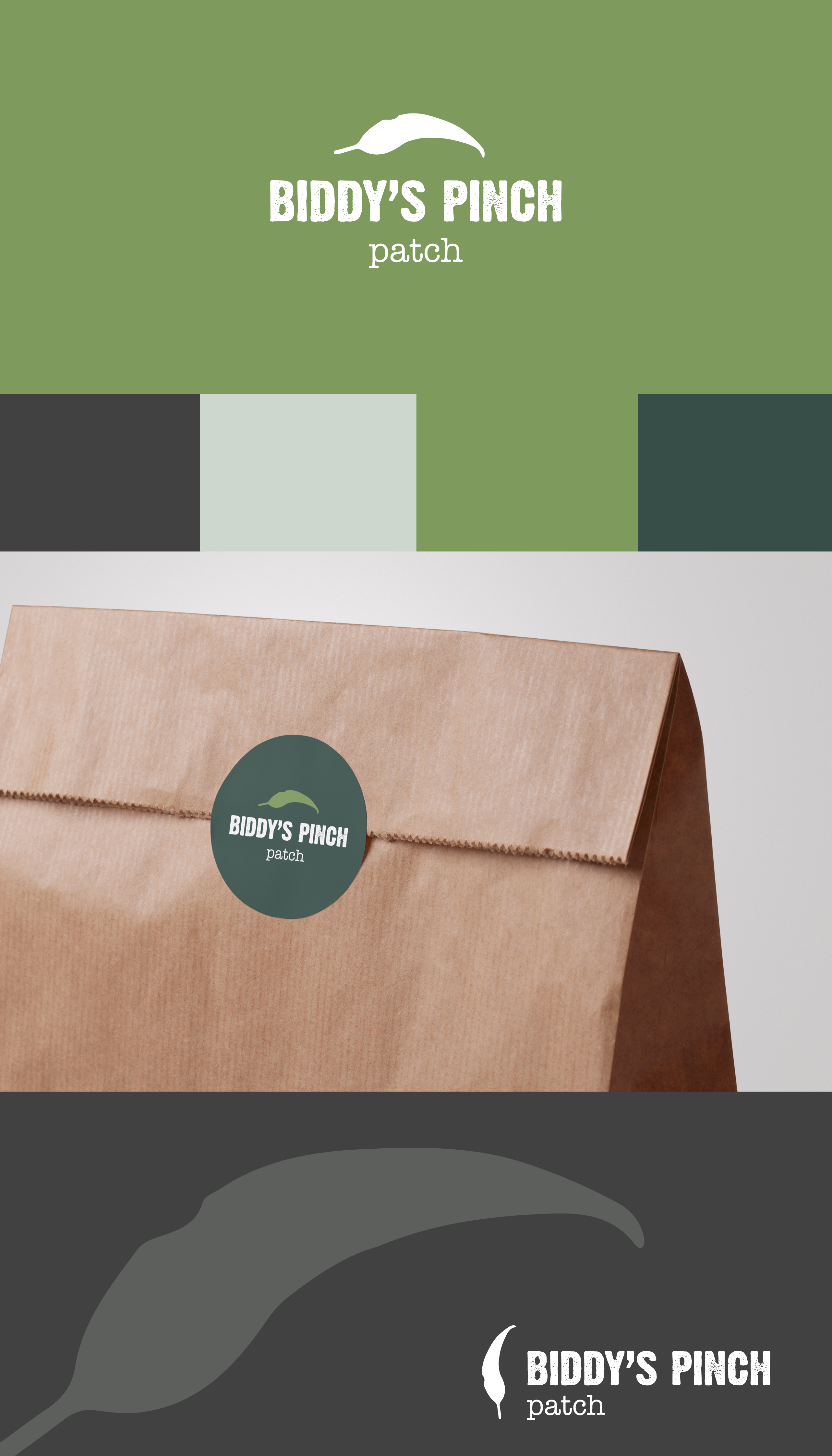
A bold, grainy, sans serif typeface evokes the rugged texture of soil, while a simple, hand-drawn leaf illustration serves as a gentle nod to the organic nature of their produce. Together, these elements give the brand a rustic charm that speaks to consumers looking for farm-fresh delights.
© 2024 All rights Reserved. Design by me.